In May 2026, Apple's Liquid Glass redesign won a Gold Cube at the Art Directors Club of New York awards — one of the most prestigious honors in the field. A few weeks later, at WWDC, Apple announced it was rebuilding the foundations of that same design to fix readability, and adding a slider so users could dial the glass back from "ultra clear" to "fully tinted."
Read those two sentences together and you've got the whole story of contemporary interface design in one contradiction. The jury gave it a Gold Cube. The maker gave users an escape hatch. Both were right.
This is the most instructive design event of the year, and not for the reason most hot takes suggest. The lesson isn't "Apple messed up." It's about what happens when beauty and usability are allowed to compete — and which one a studio should let win when they do.
A genuinely beautiful idea
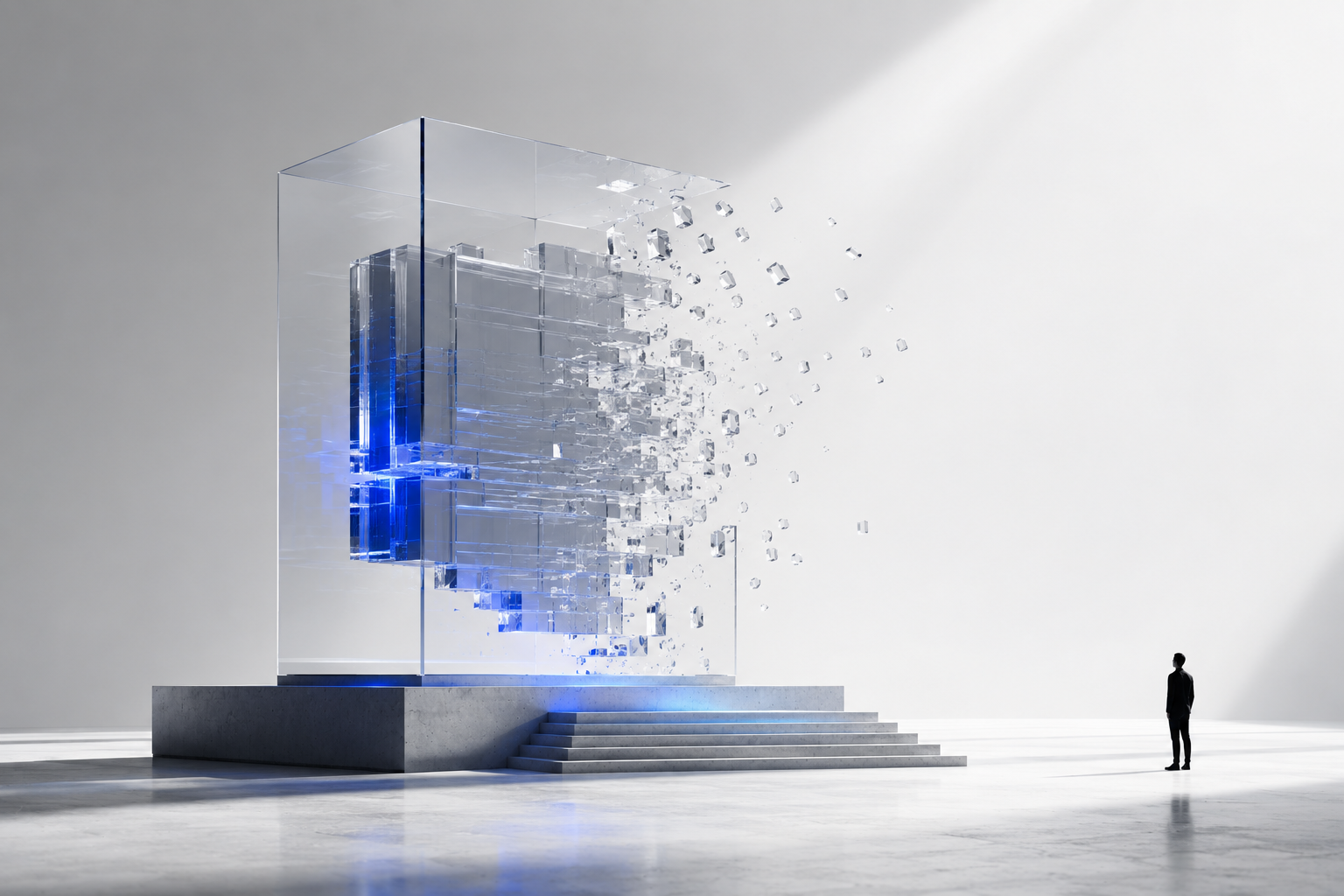
Let's give Liquid Glass its due, because the craft is real. The concept is a translucent material that refracts and reflects what's behind it — buttons and panels that look carved from frosted glass, floating above your wallpaper, catching light as you tilt the device. It's a coherent, ambitious reimagining of how a whole operating system could feel, scaling one material from the smallest control to the system-wide structure. The award was not a mistake. As an aesthetic achievement, it earned the Cube.
And then people started using it.
Where it cracked
The complaints were not edge cases, and they were not subjective taste. They were measurable.
The single most cited problem was contrast. Because the material's appearance shifts with whatever sits behind it, text legibility becomes a gamble — fine over a calm background, illegible over a busy one. Accessibility testers clocked contrast ratios as low as 1.5:1 in places. The WCAG floor for body text is 4.5:1. That's not "slightly under." That's a third of the required difference between text and its background, on shipping software, from the company that arguably invented modern accessibility.
For users with low vision, dyslexia, or even just a bright screen in direct sunlight, that's the difference between a usable interface and an unusable one. Critics noted text and icons getting lost on busy backgrounds, buttons blending into decorative layers so you couldn't tell what was tappable, and a general rise in cognitive load — the quiet tax of having to work to parse a screen that used to be effortless. There were performance costs too: all that real-time refraction strains lower-power hardware, where the fallback rarely matches the intended look.
None of this means the designers were careless. It means a beautiful material was applied to surfaces whose first job is to be read — and beauty lost the argument it should never have been allowed to enter.
The principle: clarity is not negotiable with form
Here's where we plant our flag, because this is the studio's whole reason for existing.
Contrast is not a complex accessibility setting buried three menus deep. It's one of the simplest, most fundamental things an interface can get right — and it's the thing most often sacrificed at the altar of aesthetics. When a team chooses low contrast because it looks more elegant, they are not making a neutral style decision. They are excluding the users who can least afford to be excluded, and adding friction for everyone else, in exchange for a screenshot that looks good on a slide.
Good contrast isn't a design preference. It's a requirement. The same is true of legible type, obvious tap targets, and motion that clarifies rather than distracts. These are not the parts of an interface you decorate. They're the parts you protect.
This is what we mean when we say clarity before form. Not "ugly but functional" — that's a false choice, and a lazy one. We mean that legibility, hierarchy, and usability are the non-negotiable foundation, and beauty is what you build on top of that foundation, never the thing you trade it away for. Frosted glass can be gorgeous and accessible at the same time — but only if you give it enough opacity to stay readable, limit transparency to the non-critical areas, and keep solid ground under the elements that carry meaning. The illusion of depth is a luxury. Reading the screen is the job.
The tell: Apple's own fix proves the point
The most revealing part of this whole saga isn't the criticism. It's Apple's response.
They didn't defend the readability. They rebuilt the foundations of the material specifically to improve it — diffusing busy content behind the glass to create separation, refining icons for cohesion. And crucially, they added a slider so each person can set the transparency anywhere from ultra clear to fully tinted, because, as they put it, everyone's preference varies.
Sit with that. The fix for "beautiful but hard to read" was to let users turn the beauty down. That's an admission, in shipped code, that the aesthetic was overdrawn against the budget of usability — and that the correction is to hand control back to the person actually trying to read their notifications. It's the right fix. It's also a quiet confession that the original balance was wrong.
There's a deeper lesson in the slider, too: when a single visual direction can't serve every context and every pair of eyes, the answer is often adaptivity, not a fixed grand statement. The interface that bends to the user beats the interface that demands the user adapt to it.
What we take from it
We're not interested in dunking on Apple. They make extraordinary things, they responded fast, and they'll almost certainly land a better version. What we're interested in is the principle this whole episode throws into relief — the one we apply to every project, whether or not anyone's giving out cubes for it:
Beauty and usability are not opponents — until you let them be. The failure mode is treating clarity as a constraint on creativity rather than the foundation of it. The best work is beautiful because it's clear, not in spite of it.
Test against reality, not the mockup. Liquid Glass looks flawless in a screenshot on a curated wallpaper. It struggles over a photo of your kids in direct sun. Designs have to be proven in the messy, real conditions they'll actually live in — every background, every level of vision, every device, light mode and dark — before they ship, not after the awards.
Contrast is a floor, not a dial you're free to ignore. 4.5:1 for body text. It's the cheapest, highest-leverage thing you can get right, and getting it wrong fails the users who need you most. There is no aesthetic worth that trade.
When one look can't serve everyone, build the controls. Apple's slider is the lesson hiding inside the criticism. Adaptivity and user control aren't a retreat from a strong point of view — they're how a strong point of view survives contact with real people.
The bottom line
Liquid Glass deserved its award and deserved its slider. That's not a contradiction once you stop treating beauty and usability as rivals. The Gold Cube measured the ambition. The walk-back measured what it cost. A mature design practice holds both truths at once — and does the harder work of refusing the trade-off in the first place.
The answer changes when you shift your perspective. Look at an interface as a thing to admire, and Liquid Glass is a triumph. Look at it as a thing someone has to read, every day, in the sun, with tired eyes — and the priorities reorder themselves. That second perspective is the one we design from. It's less glamorous. It's also the only one that holds up.